CLIENT:
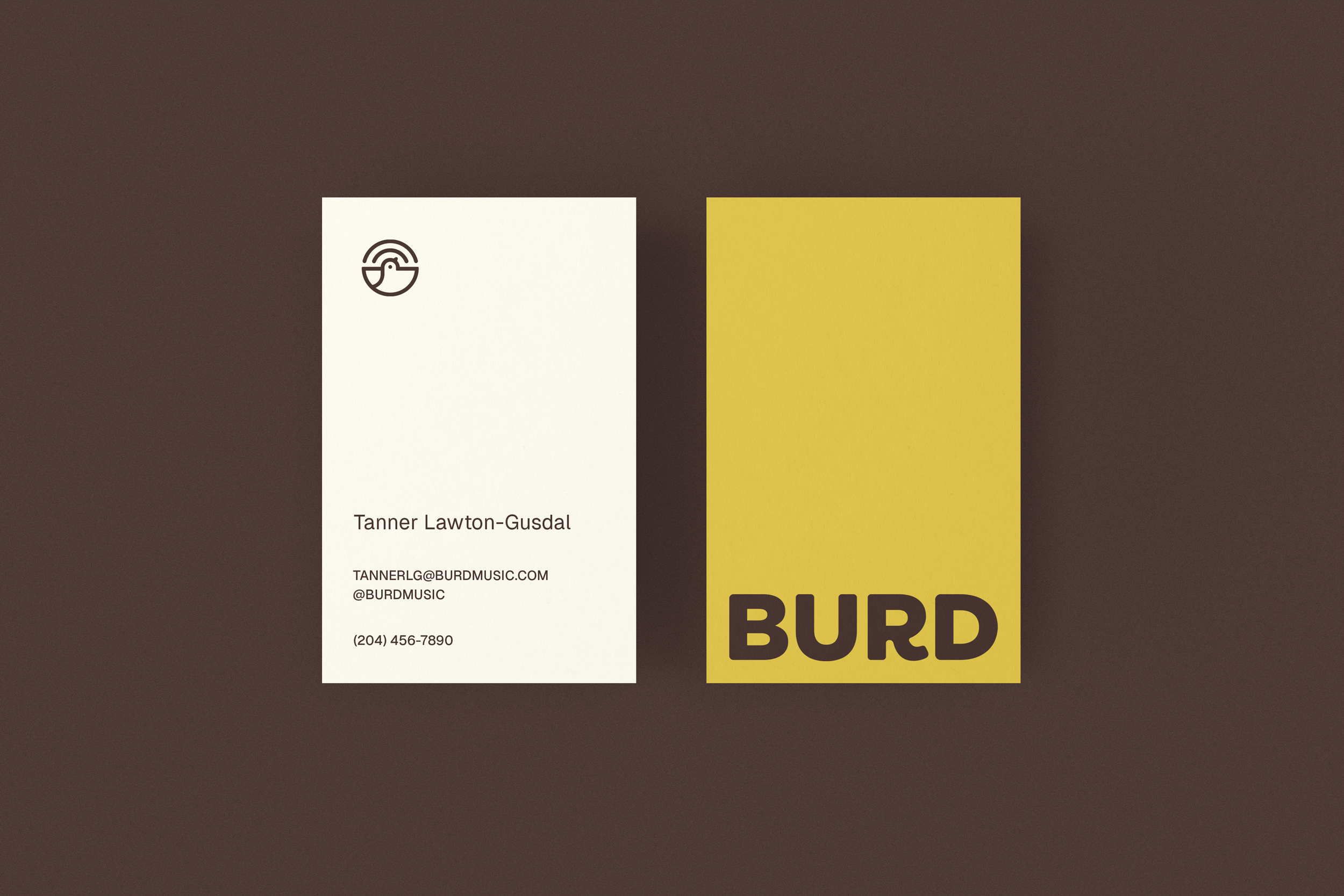
Burd Music
LOGO DESIGN
BRANDING
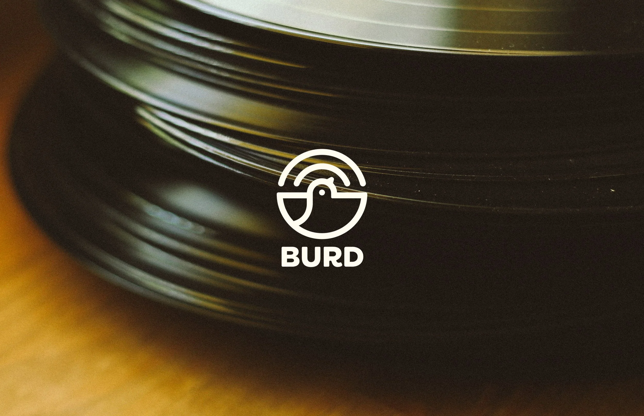
Burd is the professional identity of musician and producer Tanner Lawton-Gusdal. To step up his presence in the industry, Tanner needed a polished logo to build credibility with collaborators and labels.
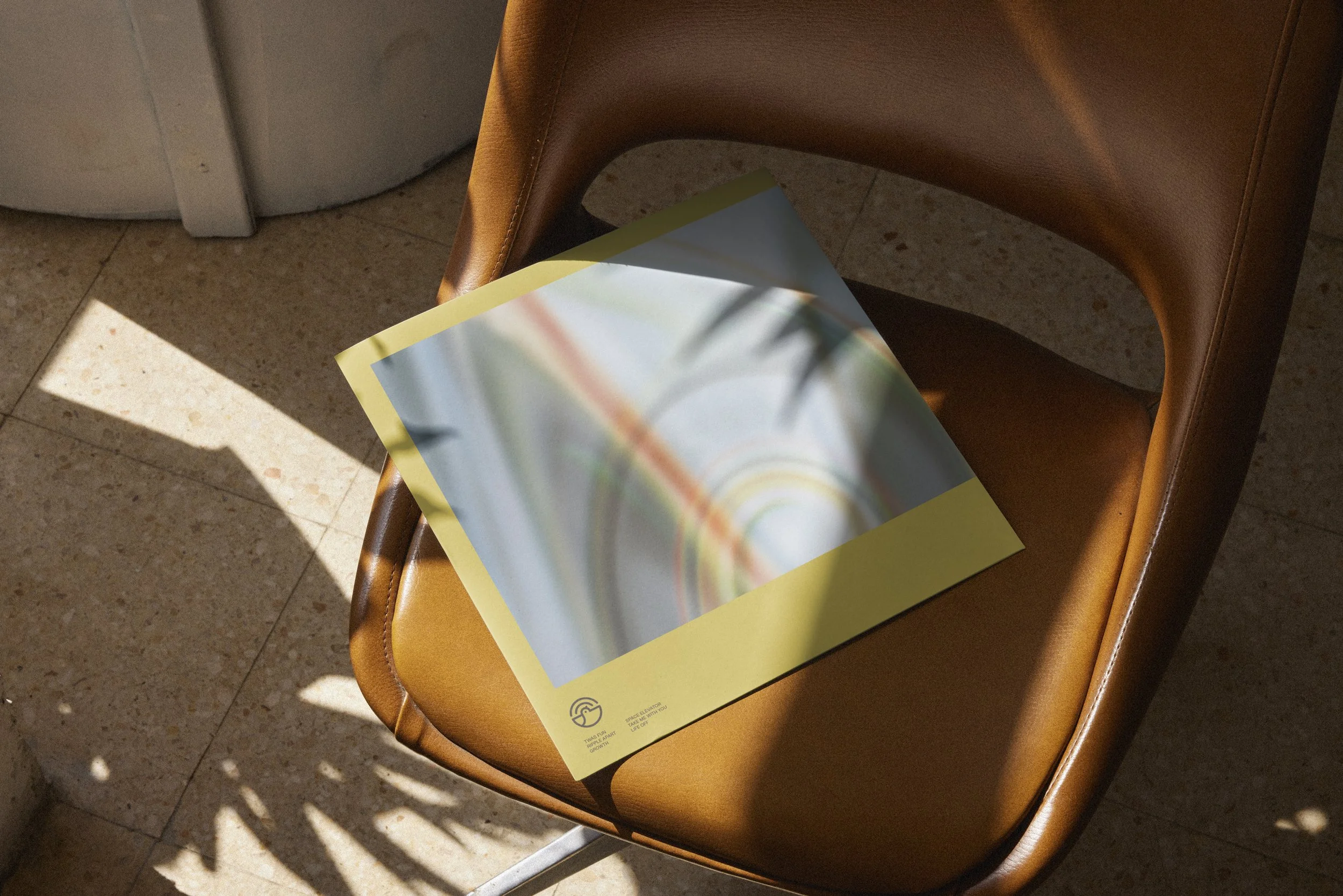
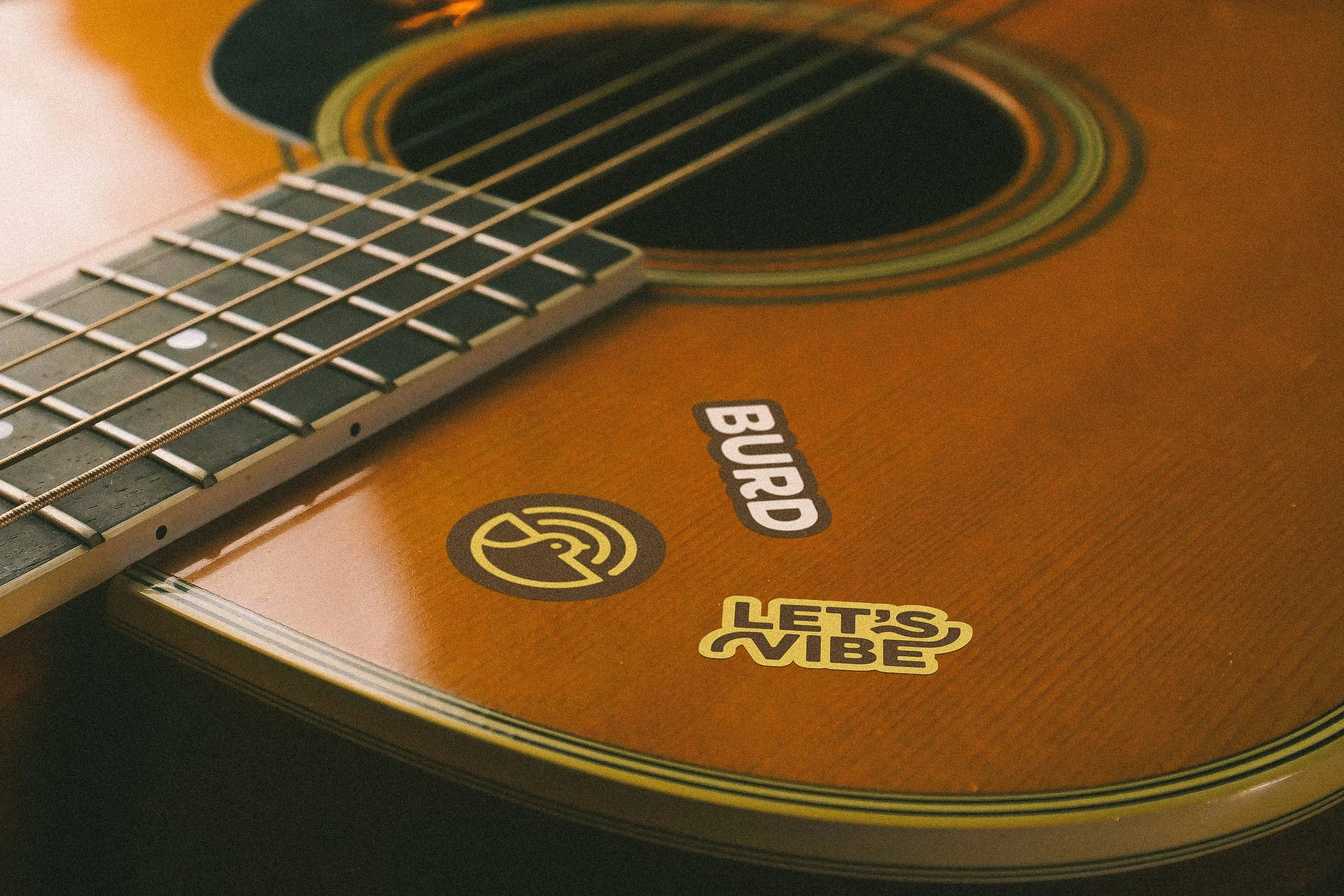
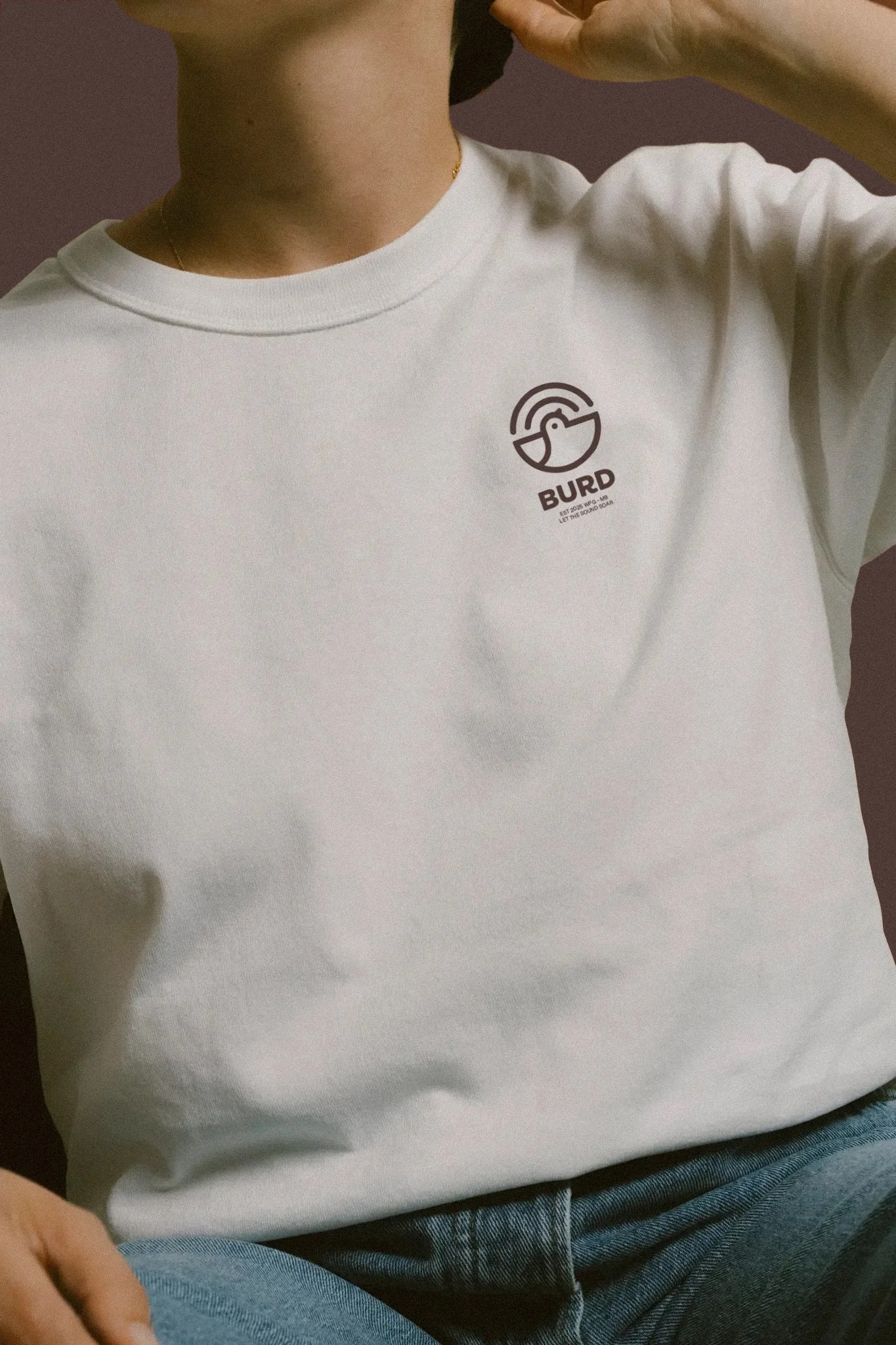
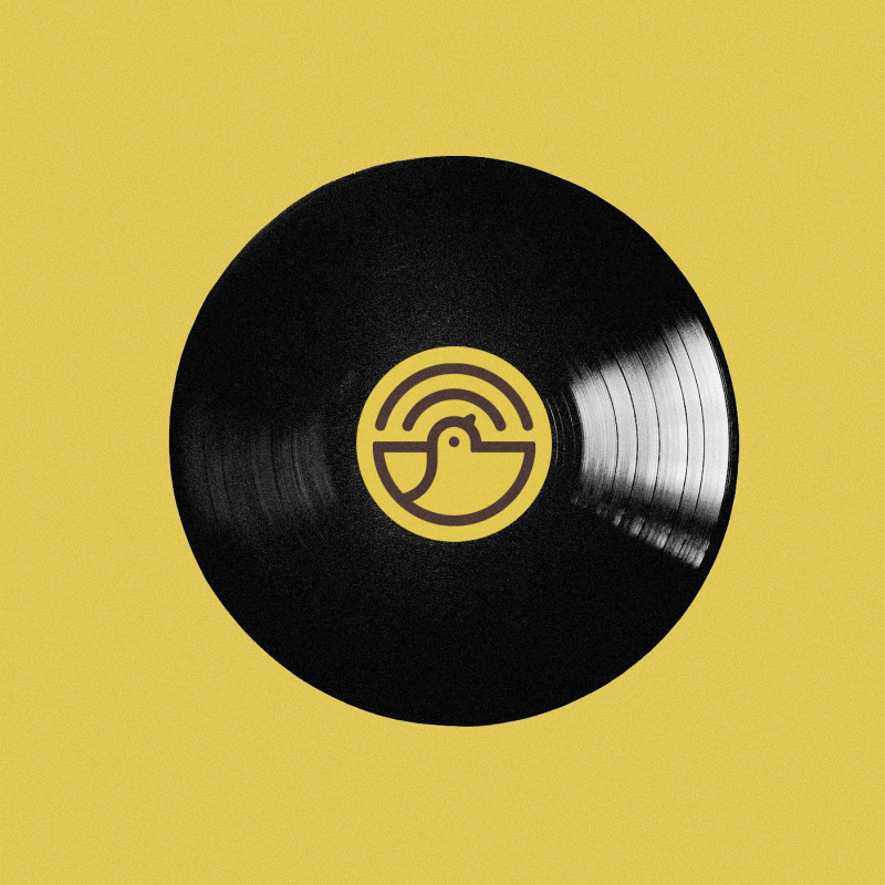
The project focused on creating a sharp recognizable icon that works everywhere, from social media and merch to crowdfunding platforms like Patreon.

Design Approach
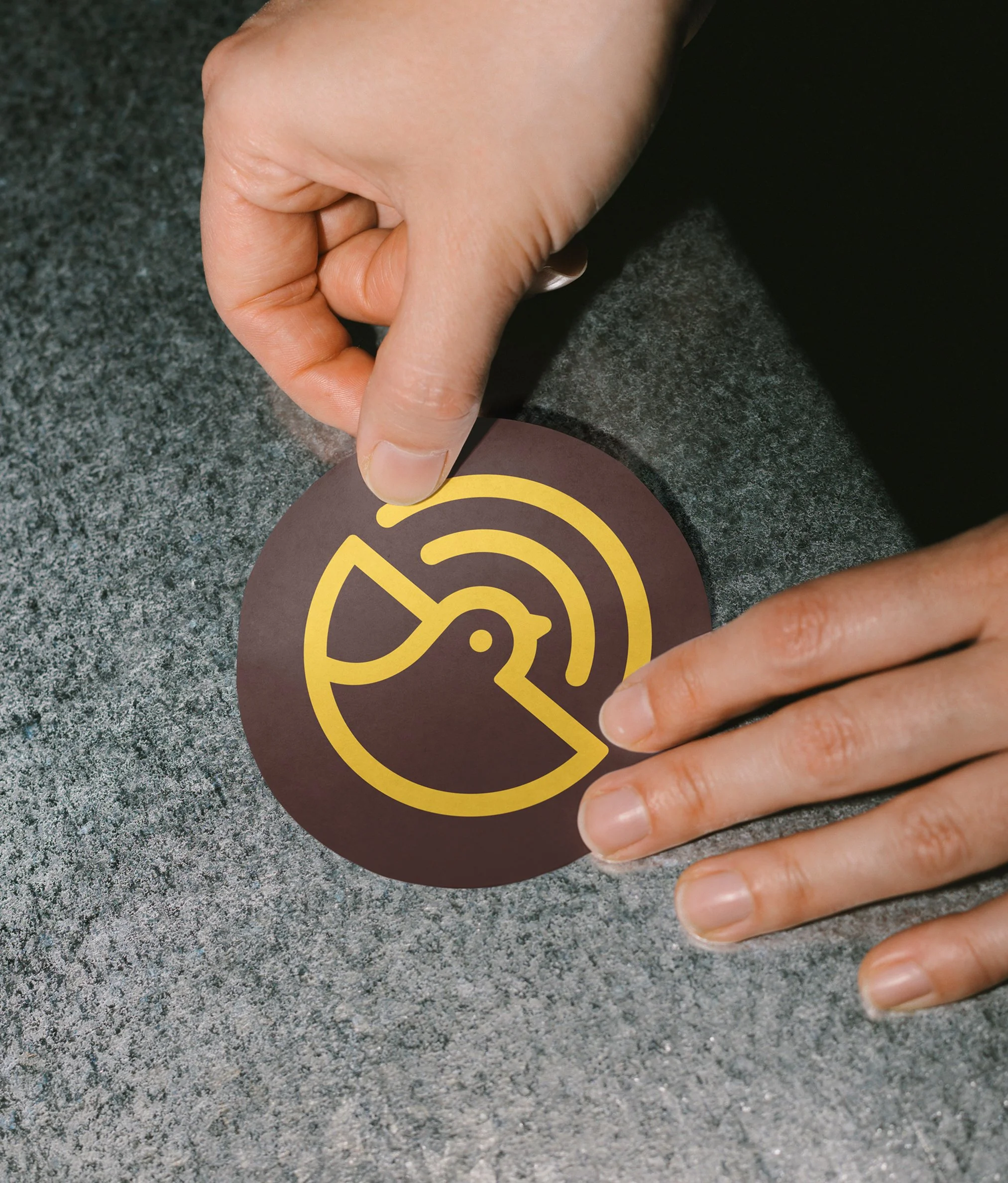
The logo uses a bird as the primary focal point. The circular lines around the bird subtly reference sound waves, reinforcing the connection to music without distracting from the main symbol. The beak is shaped like a dial, pointing to tuning and volume control.


The Results
The new Burd logo is a mark that can live anywhere – etched into a studio desk or slapped on a guitar case. It is simple, rhythmic, and eye-catching. A symbol that celebrates both the musician and the listener.