
Montessori Canada
CLIENT:
BRAND IDENTITY
PRINT DESIGN
TYPOGRAPHY
Montessori Canada is dedicated to promoting, advancing, and delivering high-quality Montessori education to children and youth across Canada.
With major changes happening in childcare funding across the country, they had to better explain why Montessori education matters. The challenge was to modernize their identity and correct common misconceptions, while strengthening support from parents.


Design Approach
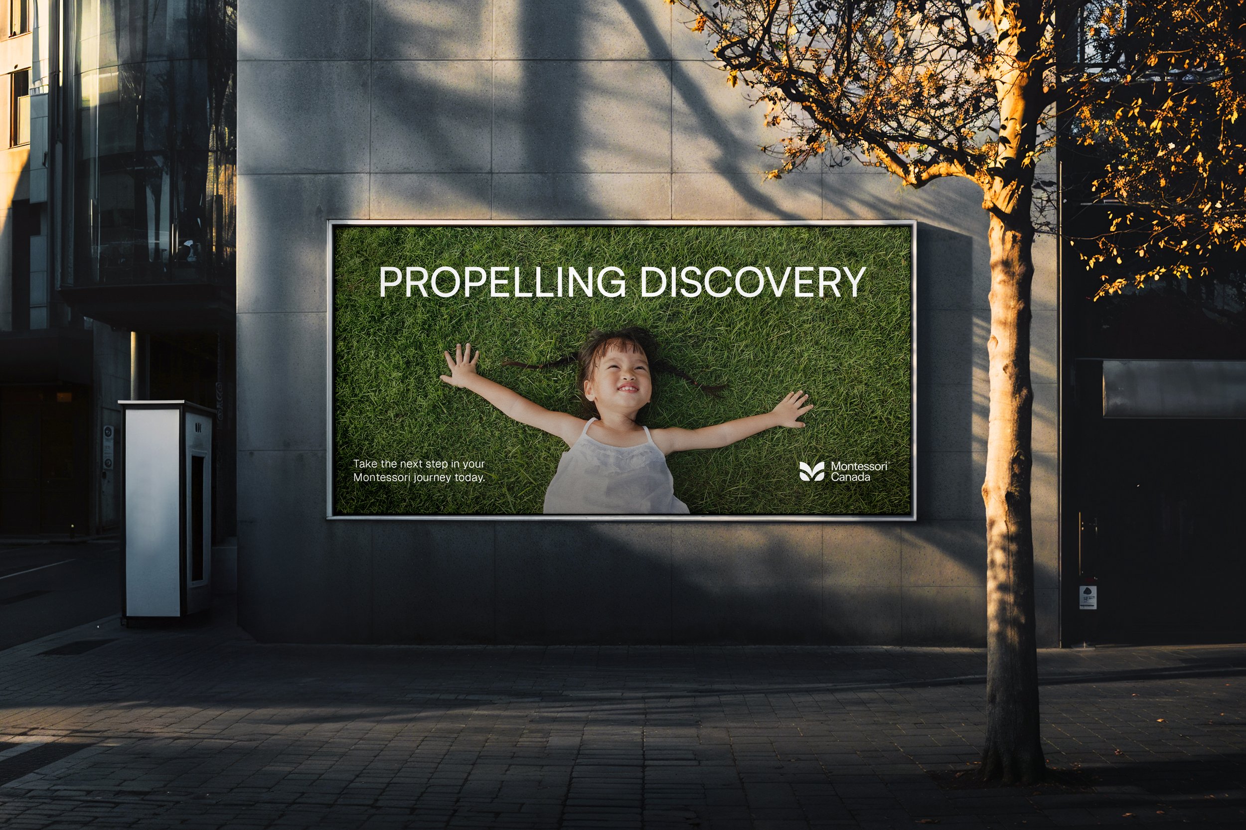
The design was about finding balance. It needed to feel warm and professional, but not too playful or childlike.
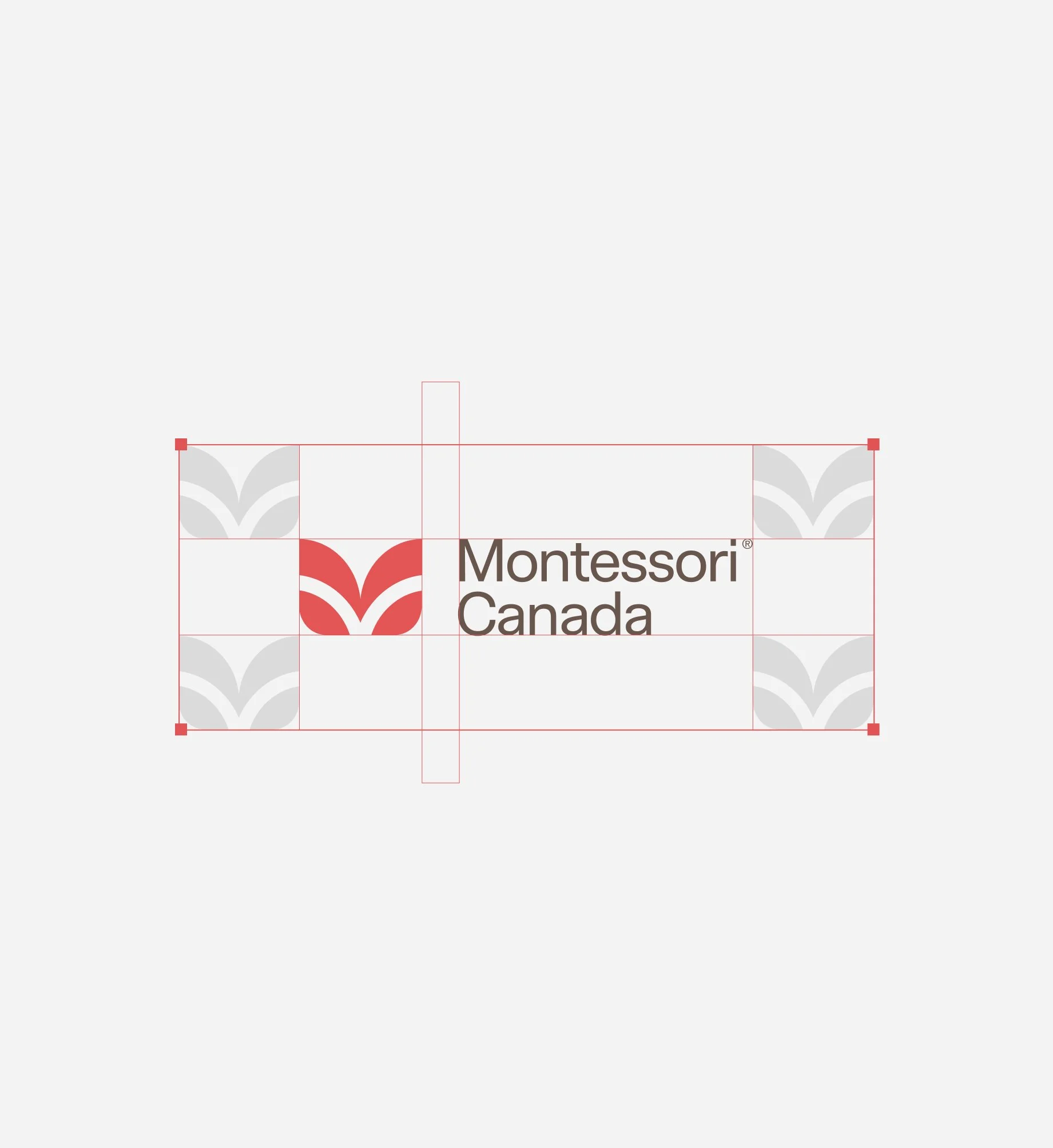
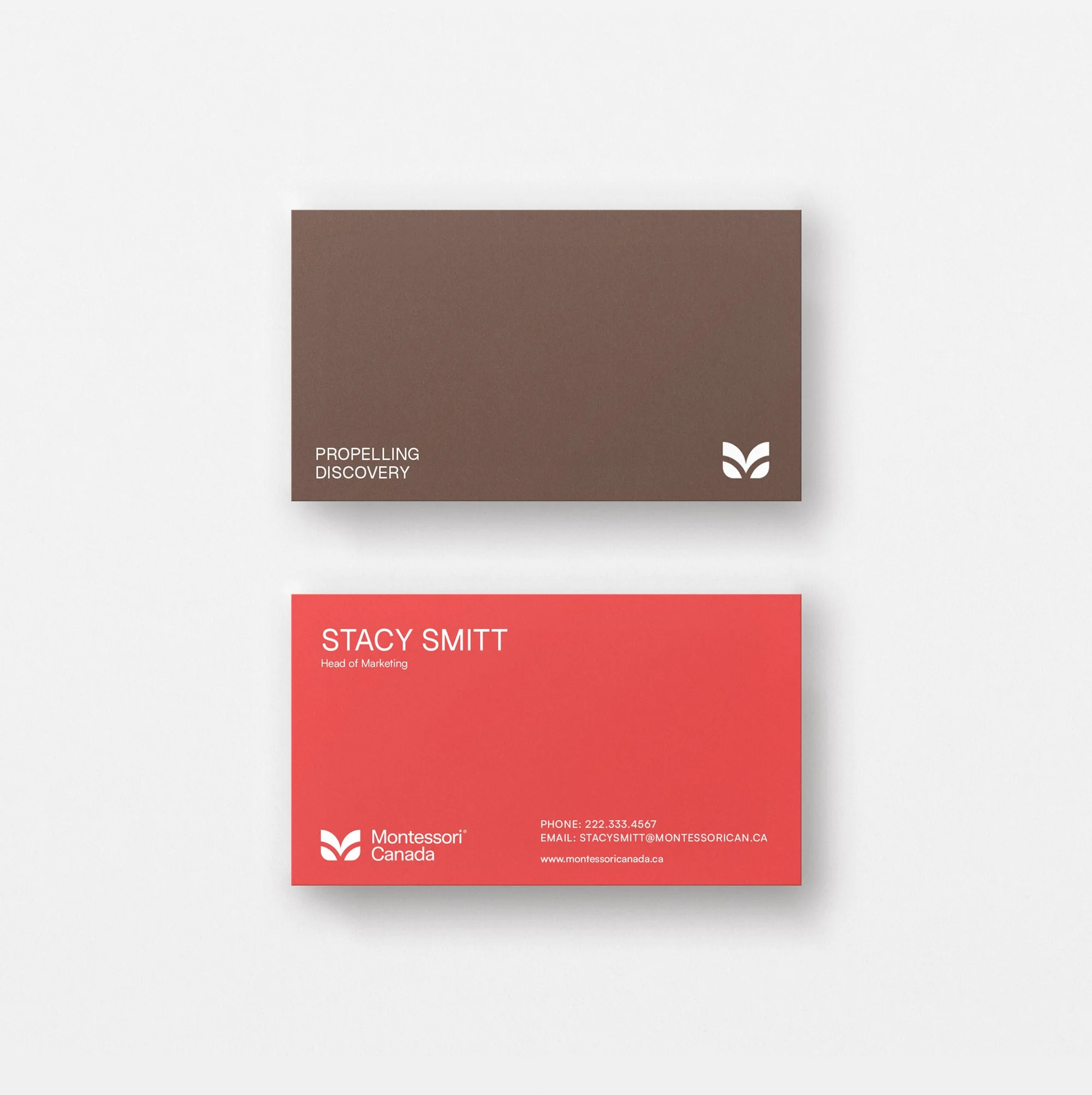
Using red was a way to embrace its Canadian identity without falling back on the usual clichés. The logo is built from simple geometric shapes that resemble a sprout, referencing growth and the Montessori philosophy of helping children flourish.
The Results
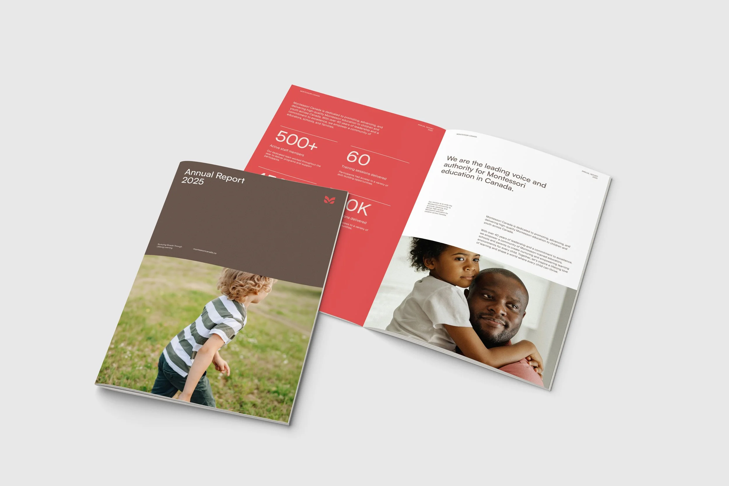
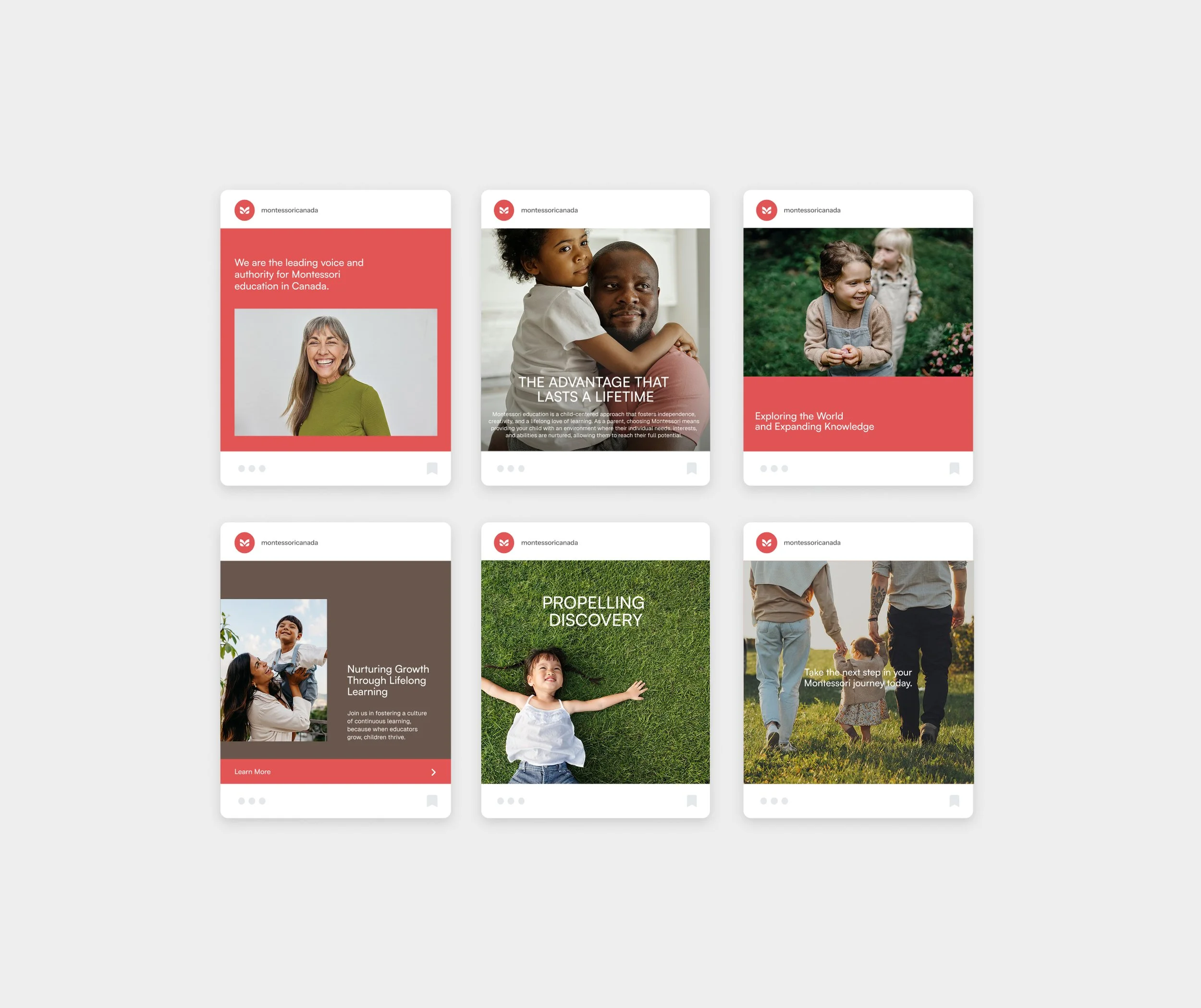
Montessori Canada now has a premium aesthetic and is clearly positioned as a national association. The identity is cohesive across channels and the website experience is simple to navigate with a straightforward sign-up flow for new members. It’s a clean presence that’s easy to understand and engage with.